InteractiveCards
Scroll-driven paintings portfolio with fan, conveyor, and detail-view phases.
Live demo
01Scroll the page to step through the three phases: fan → conveyor → detail view (click a card). The component owns its own sticky pin and tall scroll spacer, so let it fill the route below.
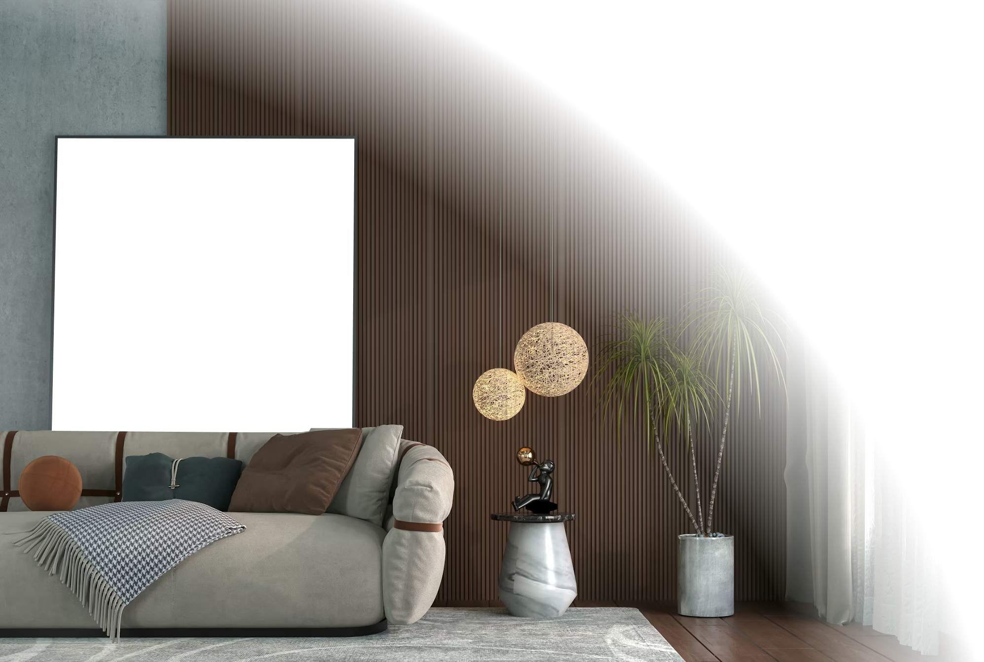
Every brushstroke
deserves a gallery.
Hand-picked originals and limited edition prints from a collective of working painters. Every piece is signed, numbered, and shipped museum-ready.


Implementation
02<script>
import InteractiveCards from '$lib/components/InteractiveCards.svelte';
</script>
<!-- The component manages its own sticky-pinned scroll region -->
<InteractiveCards />InteractiveCards is a multi-phase scroll-driven gallery: cards rise from below, fan into a parabolic arc, then travel along a curved diagonal conveyor. Click a card for a detail view with size, material and add-to-cart pills. Layout pinning uses native position: sticky inside a tall outer spacer — no GSAP required — and per-frame spring interpolation runs through requestAnimationFrame.
API
04| Prop | Type | Default | Description |
|---|---|---|---|
projects | InteractiveProject[] | fallback constants | Paintings to render in the conveyor and detail view. |
testimonials | InteractiveTestimonial[] | fallback constants | Testimonials shown in the awards / quotes section. |