Svelte 5 Component Templates
Modern interactions. Smooth animations. Clean design. A growing collection of production-ready Svelte 5 components, inspired by Magic UI, Aceternity, and Sikandar S. Bhide's animation-svelte.
Rebuilt with runes, thoroughly documented, made accessible, with some original creations mixed in. Copy, customise, and use in your projects.
Built by @Jktfe with patient support from Claude. Feel free to use, adapt, and let me know where you use it!
Component Categories
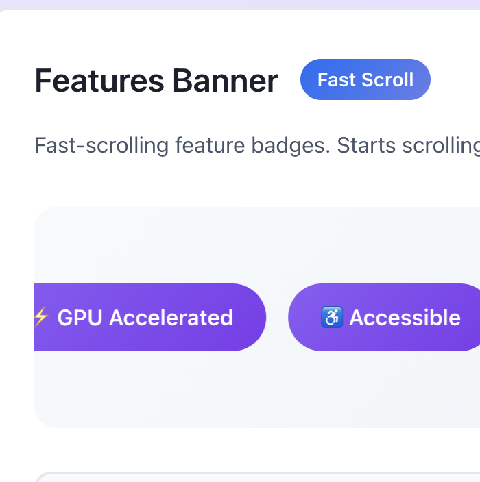
31 components organised into 11 categories. Hover to preview, click to select, then follow the link to see the demo.
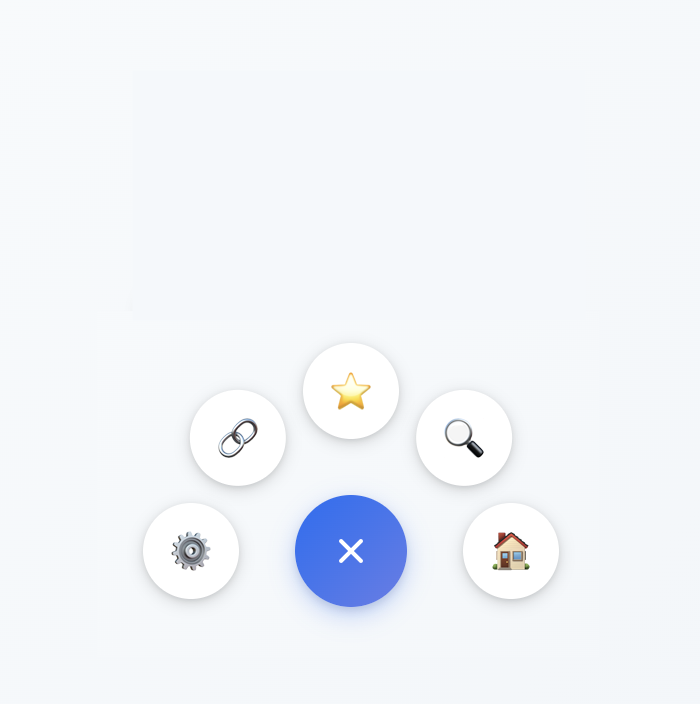
Navigation 2
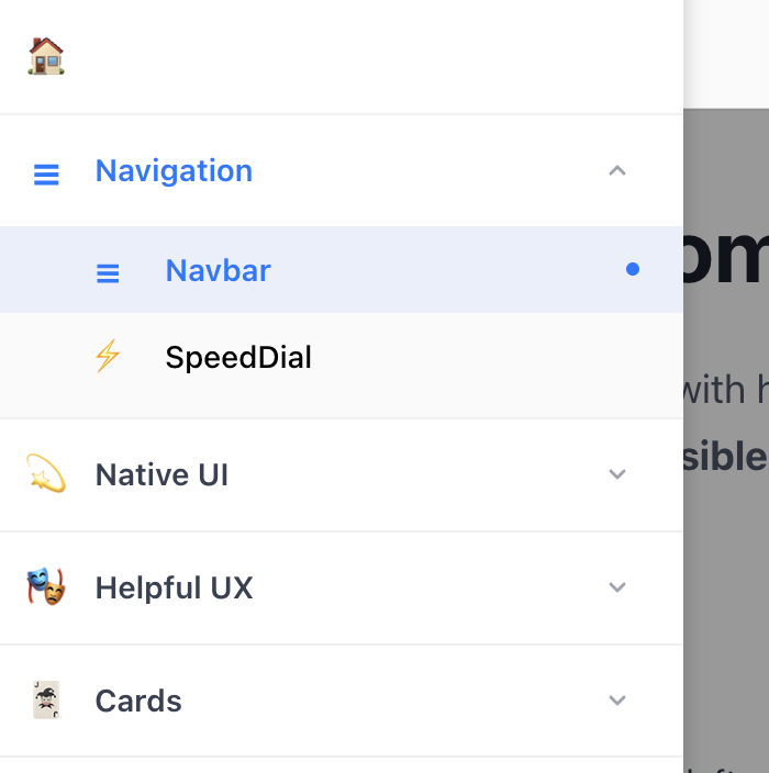
Native UI 3

Helpful UX 3
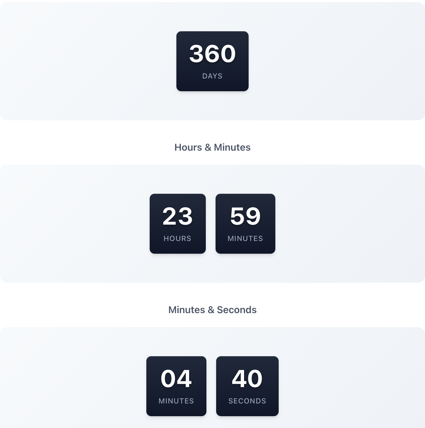
Time 2
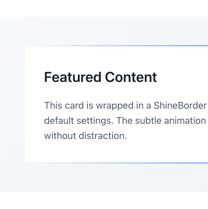
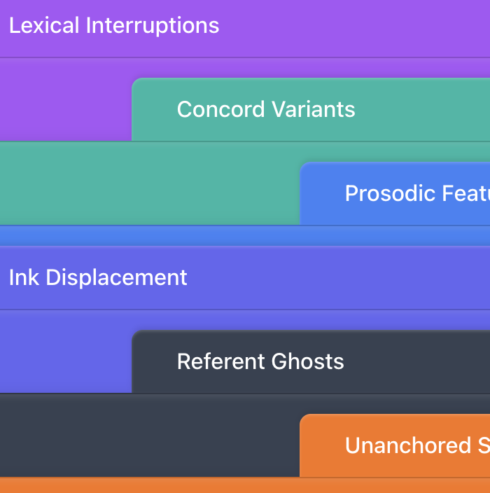
Cards 3
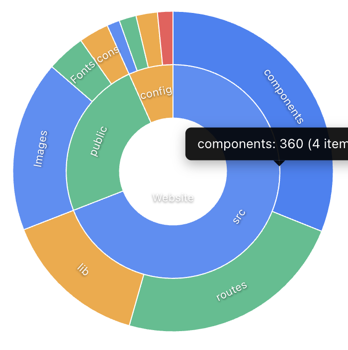
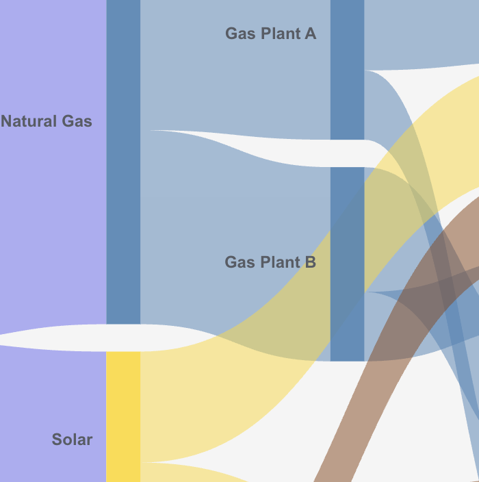
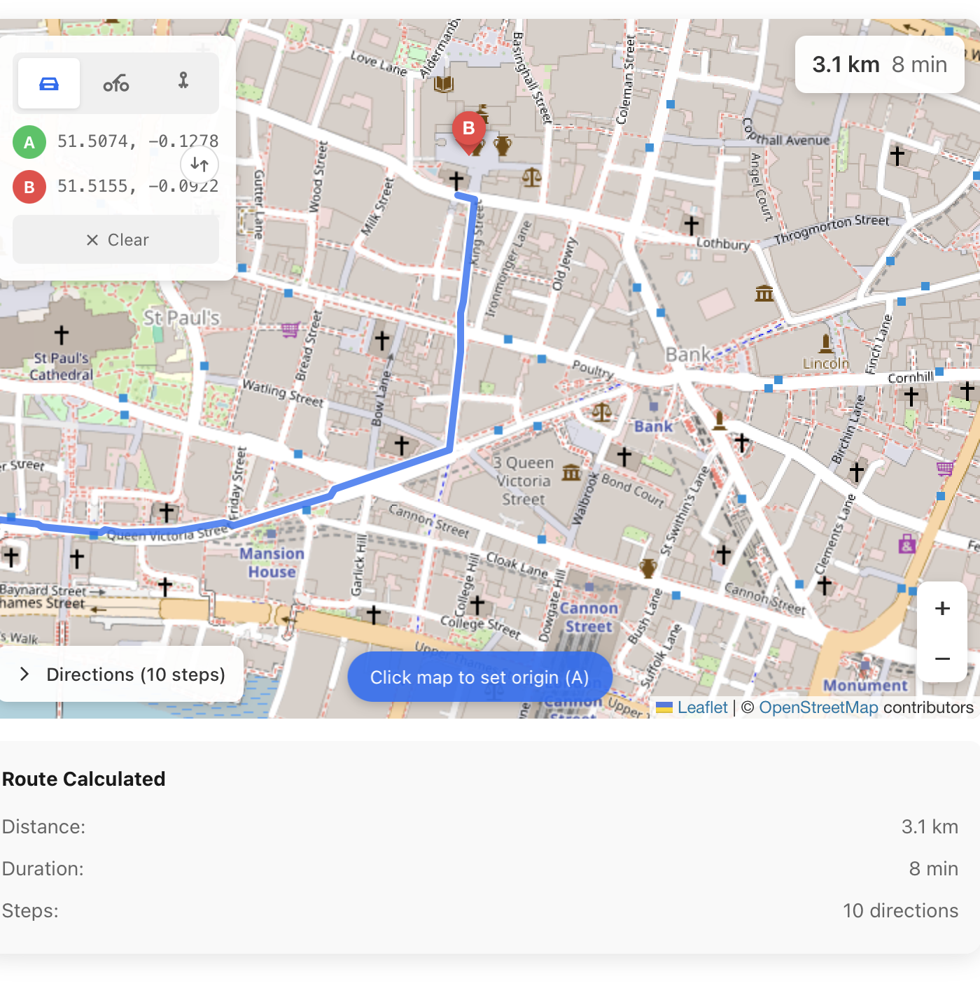
Data Visualisation 5
Interactive 3

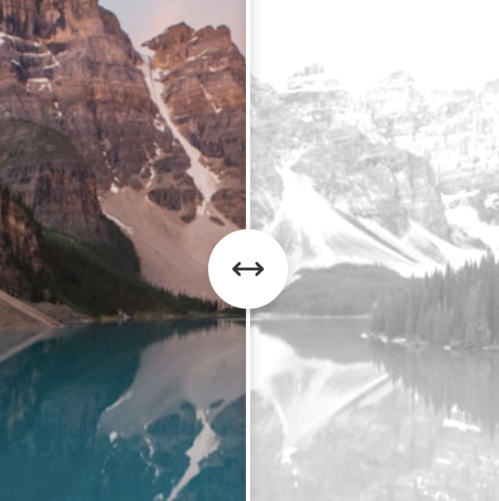
Media & Images 2
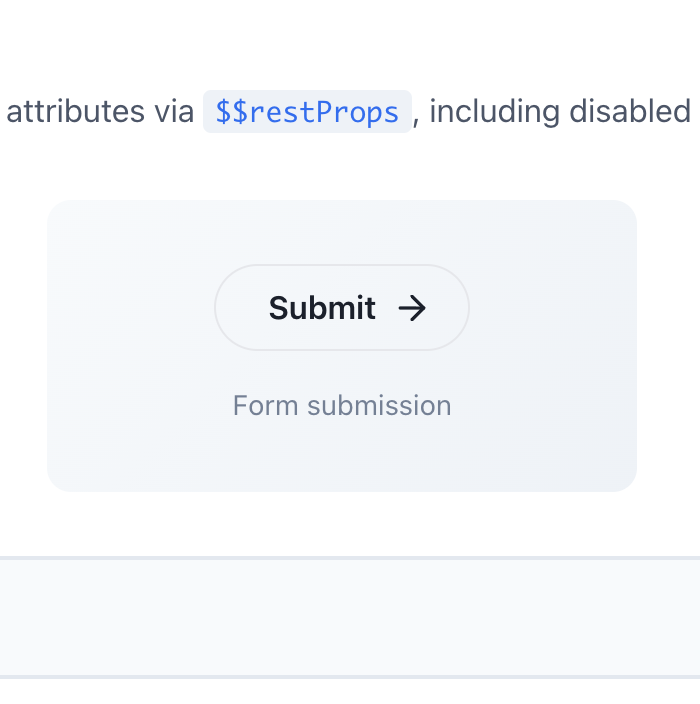
Forms & CRUD 2
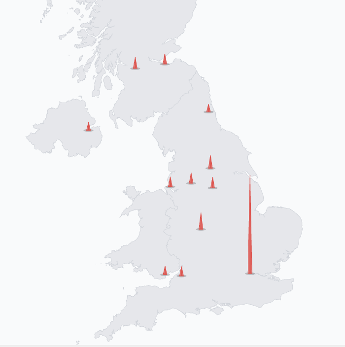
Location Ops 3
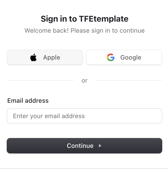
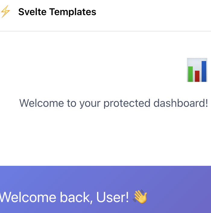
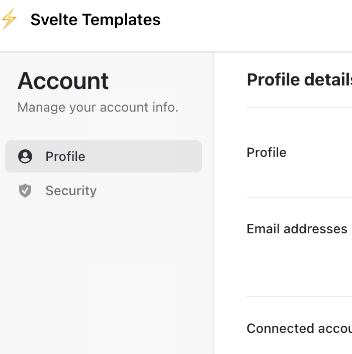
Authentication 3
Quick Start
Browse Components
Explore the categories above to find the components you need.
Copy to Your Project
Copy component files from src/lib/components/ to your project.
Customise & Use
Import and use with your data. All props are fully typed and documented.